My research into this project has come after my initial sketches and ideas generation in order to not clowd my mind with what is being produced already. Once a few ideas are down on paper I can begin to look into how others have approached the brief and how professionals have created lettering similar to how I want my final outcome to be.


The work produced on this promotional poster has massive impact, I am disragarding the use of colour here as something that adds to the way the lettering looks, simply because I will have to work in black and white with no half tones. What I can take from this poster however is the spacing, position and scale of each letter, the designer has allowed an overall solid shape to create the letter instead of using line work.
Each letter works within a frame as mine will and each square frame still allows for curves and the splitting of the shapes to create letters.
Each letter works within a frame as mine will and each square frame still allows for curves and the splitting of the shapes to create letters.

Design: Etnies Source: Shoe Box for Mikey Taylor Pro Shoe model.
The show box graphic from Etnies simply acts as a piece of research into how letters from different designs, materials, print methods and application can still come together, work well and form a legible sentence. As I would like to create 10 different styles of lettering this adds a bit of reassurance into what I am actually creating.
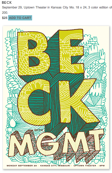


Source: tadcarpenter.com
Looking into hand crafted type meant I looked at Tad Carpenters work almost instantly, I admire his use of both rough and clean cut approaches to producing work. In the poster for Beck and MGMT he carries the fill of the type into the overall design of the poster, again colour is used to separate the two but I would still like to use pattern and this raises the possibility of not having a border to my letters, but instead I could use negative space to create a shape of a letter.

Hand rendered fonts vary above, exploring the cut and paste technique and laying the results into illustrator will most certainly work for large block sans serif type. By printing block pantone colour onto acetate and either scanning or photographing on a light box I can achieve a vibrant clash of colour, hand render outlines and create a type in illustrator.

Sources: Various but referenced in image.
As I have decided to use the letter "B" at this point of my development work in the DP Blog I felt it was a good idea to double check that using another shape (straight edge) of type could be ruled out. The letter E is has very useful form when trying to communicate expansion. Design Dust have simply expanded the cornering of the letter "E" on the East Vs West design which proves very subtle. Steph Baxter has decided to expand the line work in the lower case "e" (Bottom Right, Bottom Image) so far that the middle is lost, however it is can still be defined as an "e".
The research into letter forms has began to raise more questions and possibilities of how subtle I can be when producing the lettering. I think it is advisable to create a mixture within the 10 final outcomes of subtle, obvious, negative space, positive space, block colouring, simple line work and so on. As I am not wanting top produce a sequence this is possible but must not be displayed/presented as a mismatch approach to the brief.
No comments:
Post a Comment